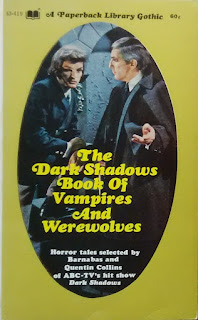
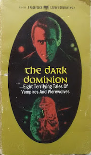
The Dark Shadows Book of Vampires and Werewolves appeared in print in August 1970, copyright by Dan Curtis Productions, who produced the television show. It has the same essential cover design of all the other Dark Shadows books---an oval cover illustration including the title, surrounded by a gold color. (See a list here --scroll down a bit-- of the Dark Shadows novels, with covers.)
So I wondered: could the books have been edited by the same person? Might the original volume have been planned to be bigger, and the second volume made up of leftover tales? It turns out that my guess was correct. When I looked into Bernhardt J. Hurwood, everything felt into place.
Hurwood (1926-1987) was a prolific free-lance writer, who published over sixty books. His archive of papers are held at the Popular Culture Library at Bowling Green State University in Bowling Green, Ohio. I am grateful to Tyne Lowe, Manuscript Archivist at the Browne Popular Culture Library, for her assistance on this question.
The brief answer is that the archive confirms that Hurwood was commissioned to edit a larger volume, which was to be called The Barnabas Collins Vampire and Werewolf Reader. There are a number of prospective contents pages, with notations of copyright status and amounts to be paid for materials still under copyright. Dan Curtis Productions rejected half of the material, and it was decided by the publisher to bring out The Dark Dominion, for which no approval by Dan Curtis Productions was needed. Hurwood was excited that, having two books, he would get paid twice. But no second payment was forthcoming, and by January 1971, Hurwood was complaining to his editor at Paperback Library, noting his firm belief that all publishers do their best to screw their writers if they think they can get away with it. Whether Hurwood ever got paid for the second anthology is unknown.
But the mystery of editorship of both anthologies is resolved. Bernhardt J. Hurwood edited both The Dark Shadows Book of Vampires and Werewolves and The Dark Dominion. The books stand alongside other anthologies actually credited to him, including Monsters Galore (1965) and Passport to the Supernatural (1972), and several collections of his own supernatural fiction for juveniles, including Ghosts Ghouls & Other Horrors (1971), Vampires, Werewolves & Other Demons (1972), Eerie Tales of Terror & Dread (1973), Chilling Ghost Stories (1973), and Strange Curses (1975). He also wrote novels under various pseudonyms, including Dracutwig (1969) as by Mallory T. Knight, (to quote the cover blurb) "the outrageous adventures of a luscious little sexpot who is the daughter of Dracula, has a body like Twiggy -- and turns into a vampire every time she makes love!" Hurwood's work on the nonfiction book Terror by Night (1963) convinced him of the "heavy sexual undertones" in the folklore of vampirism and lycanthory, and he continued with other nonfiction books of this type, including Monsters & Nightmares (1967), Vampires, Werewolves and Ghouls (1968), and Vampires (1981). Hurwood also branched off into writing sex-books, including nonfiction like The Golden Age of Erotica (1965) and The Bisexuals (1974); manuals like The Joys of Oral Love (1975), The Whole Sex Catalogue (1975), as well as erotica like When Maidens Were Deflowered and Knightly Lost Their Heads (1967), as by D, Gunther Wilde.
The Bernhardt J. Hurwood Collection at the Browne Popular Culture Library looks to be a fascinating resource. For a wealth of detail, see the Finding Aid to the Collection here.


For the Dark Shadows books, it was not just the oval image but the typeface that was characteristic of that series.
ReplyDeleteIt was used at that time for other paperback Gothics, e.g. Dorothy Daniels’s The Man from Yesterday and Mystic Manor, Barbara Michael’s The Master of Blacktower. Lancer used it for two Lovecraft paperbacks, The Colour Out of Space and The Dunwich Horror. It was also used for some fantasy, whether presumed rubbish (Kothar and the Demon Queen) or classic (At the Edge of the World, Ballantine’s first collection of Dunsany’s stories).
I only ever owned the Dunsany (a favorite) and Lovecraft books, but I suppose it’s largely because of them that I remember the reign of that typeface – Something Italic, it must be; perhaps someone knows its proper name.
Dale Nelson
Wonderful to read
ReplyDeleteThank a lot for some great research! It might be noted that DRACUTWIG was accorded a place in R.S Hadji's list of "13 Worst Stinkers of the Weird" (Twilight Zone Magazine June 1983)
ReplyDeleteI new I recognized that title from somewhere! Thanks for the reminder of where!
ReplyDeleteI've remembered now what it was that probably first caught my eye about that typeface -- and this was before the 1970s. Ace Books used it for the title of its long-running series of Man from U.N.C.L.E. novels. I was a fan of the TV series as a youngster and probably bought one or two of the books, which I would have pored over.
ReplyDeleteDale Nelson
Thanks to a helpful member of the Science Fiction and Fantasy Chronicles Forums site, I can report that the typeface appears to be Cooper Black Swash Italic.
ReplyDeleteDale Nelson